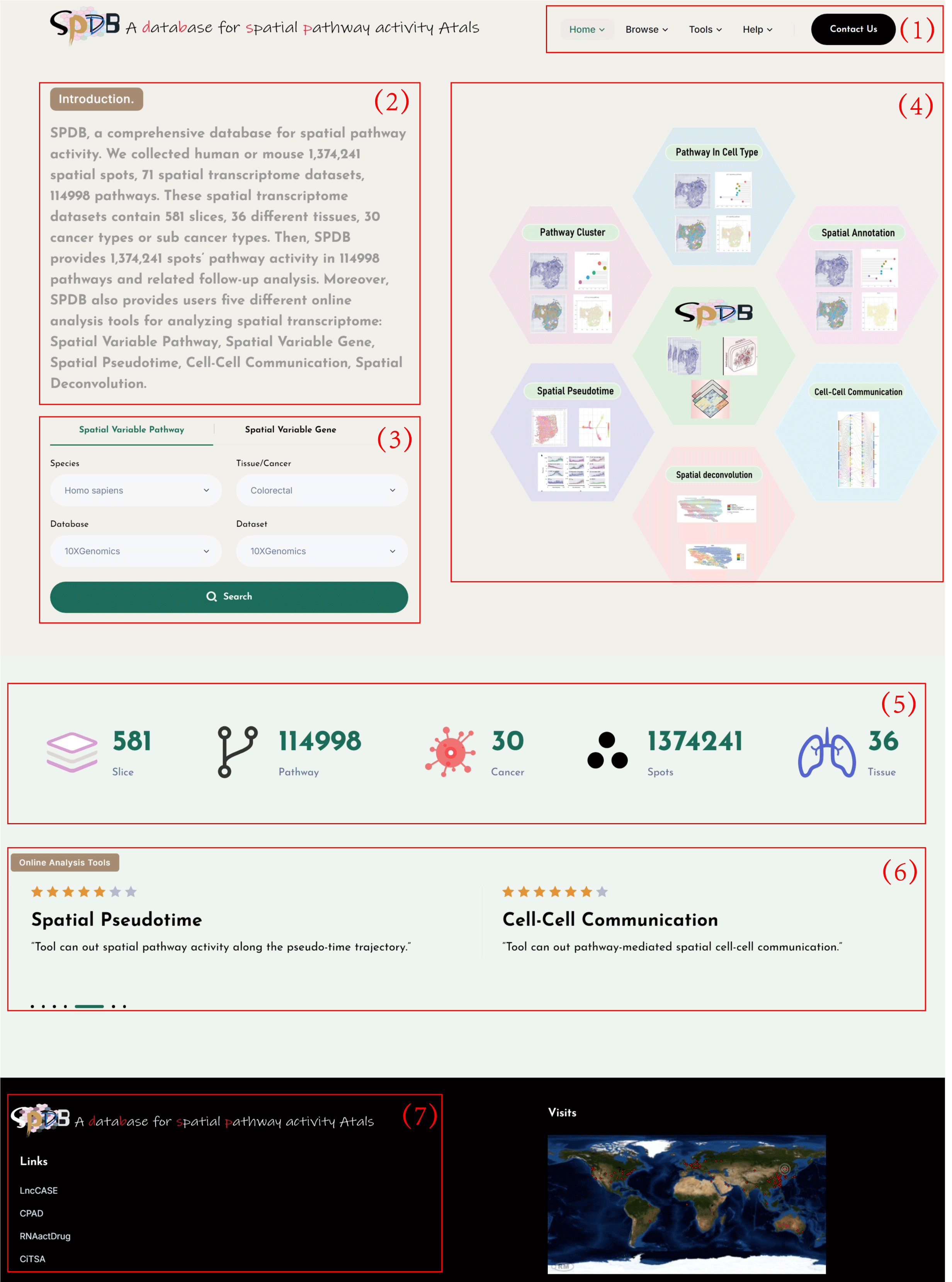
Home
(1)Main functions of the database are provided in menu bar form.
(2)The brief introduction of SPDB.
(3)Data quick search for SPDB.
(4)The framework of SPDB.
(5)Data statistics information in SPDB.
(6)The analysis tools introduction of SPDB.
(7)Links to our previously published database.
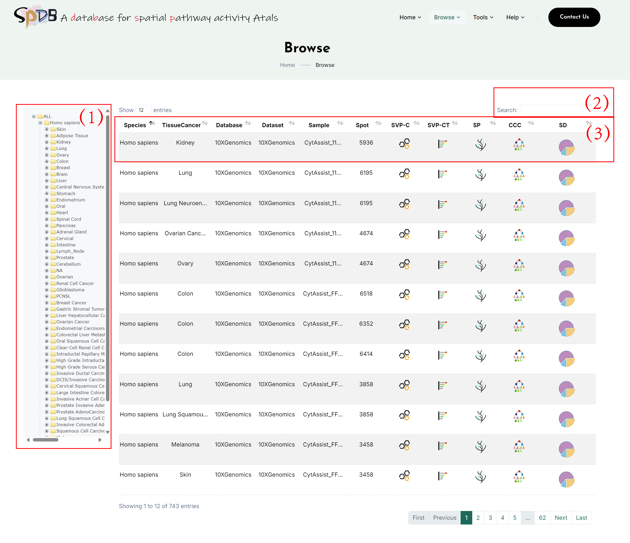
Browse
(1)Choose the tissue or cancer type in our database providing spatial transcriptome
datasets to view analysis results.
(2)Input special data ID search in our database.
(3)After users choose one tissue or cancer type, SPDB provide the relevant datasets’ slice
information and the online analysis tools, click to the interest analysis to get this
slice’s analysis outcome.
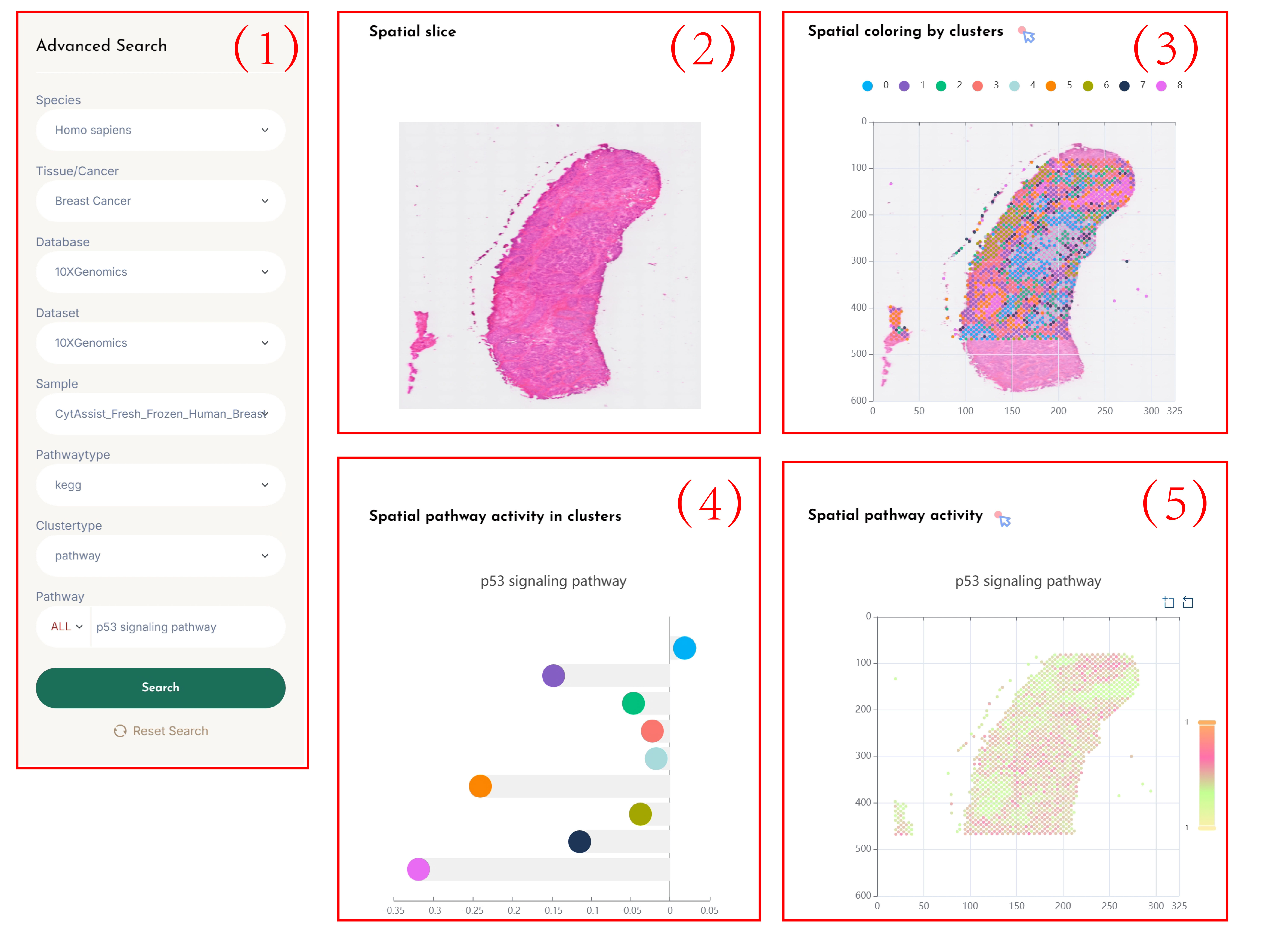
SVP-Cluster
(1)Click on each of the 8 dropdown boxes to select your desired Species, Tissue/Cancer, Database, Dataset, Sample, Pathway type, Clustertype (pathway/gene), and SVP.
Enter the name of the pathway you are interested in the Pathway search box, and click the "search" button to view the results.
(2)Spatial transcriptomic data tissue sections.
(3)Cluster the spots based on the spatial pathway activity (pathway) profiles or spatial gene expression (gene) profiles according to the user's selected tissue slices,
and display a spatial transcriptomic clustering map colored according to the clusters based on the spatial location of the slices.
By clicking on the cluster categories in the legend, you can visualize the clusters of interest.
(4)Calculate the average activity of pathways in each cluster.
(5)Display a spatial transcriptomic clustering map colored according to the selected pathway's spatial pathway activity based on the spatial location of the slices.
(6)Click on the spots in Figure 5 to visualize the interaction network of the genes related to the pathway of interest.
(7)A heatmap of the top 30 pathways that are positively or negatively correlated with the selected pathway's spatial pathway activity.
The red/blue color bars indicate the positive/negative Pearson correlation scores, respectively.
(8)By clicking the rectangle corresponding to the pathway of interest in Figure 7, display the Pearson correlation scatter plot between the selected pathway and the pathway of interest.
SVP-Cell Type
(1)Click on each of the 8 dropdown boxes to select your desired Species, Tissue/Cancer, Database, Dataset, Sample, Pathway type, and Annotation Strategy (Transfer annotation/Manual annotation), and SVP.
Enter the name of the pathway you are interested in the Pathway search box, and click the "search" button to view the results.
(2)Tissue sections of spatial transcriptomic data.
(3)Cluster the spots based on the spatial gene expression profiles of the selected tissue slices, using the Transfer
annotation/Manual annotation to obtain cell types, and display a spatial transcriptomic clustering map colored according to the cell
types based on the spatial location of the slice. By clicking on the cell type categories in the legend, you can visualize the cell
types of interest.
(4)Calculate the average activity of pathways in each cell type.
(5)Display a spatial transcriptomic clustering map colored according to the spatial pathway activity of the selected pathways based on the spatial location of the slices.Click on the spots to visualize the interaction network of the genes related to the pathway of interest.
(6)The heatmap of the top 30 pathways that are positively or negatively correlated with the spatial
pathway activity of the selected pathway. The red/blue color bars indicate the positive/negative Pearson correlation
scores, respectively.clicking the rectangle corresponding to the pathway of interest.display the pearson correlation
scatter plot between the selected pathway and the pathway of interest.
SVG-Cluster
(1)Click on the 6 dropdown menus to select the desired Species, Tissue/Cancer, Database, Dataset, Sample, and SVG.
Enter the name of the gene of interest in the Gene search box and click the “search” button to view the results.
(2)Tissue sections of spatial transcriptomics data.
(3)Clusters of spots based on the spatial gene expression profile of the selected tissue section,
and a spatial transcriptomics clustering map colored by clusters according to the spatial location of the section.
You can visualize the clusters of interest by clicking on the cluster categories in the legend.
(4)Calculate the average expression level of genes in each cluster.
(5)Spatial transcriptomics clustering map colored by the spatial gene expression of the selected gene according to the spatial location of the section.
SVG-Cell Type
(1)Click on the 7 dropdown menus to select the desired Species, Tissue/Cancer, Database, Dataset, Sample, Annotation Strategy(Transfer annotation/Manual annotation),and SVG.
Enter the name of the gene of interest in the Gene search box and click the “search” button to view the results.
(2)Tissue sections of spatial transcriptomics data.
(3)Clusters of spots based on the spatial gene expression profile of the selected tissue section,
with cell types annotated by original annotation/label transfer (Transfer annotation/Manual annotation),and a spatial transcriptomics clustering map colored by cell types according to the spatial location of the section.
You can visualize the cell types of interest by clicking on the cell type categories in the legend.
(4)Calculate the average expression level of genes in each cell type.
(5)Spatial transcriptomics clustering map colored by the spatial gene expression of the selected gene according to the spatial location of the section.
Spatial Pseudotime
(1)Please click on the following 8 dropdown menus in sequence: First, select the CellType for pseudotime analysis, then select the desired Species, Tissue/Cancer, Database, Dataset, Sample, Pathway type, and SVP.
Enter the name of the pathway of interest in the Pathway search box and click the “search” button to view the results.
(2)Clusters of spots based on the spatial gene expression profile of the selected tissue section, and the spatial transcriptomics clustering map colored by Cell type.
(3)Spatial transcriptomics clustering map colored by pseudotime.
(4)Spatial transcriptomics clustering map colored by spatial pathway activity of the selected pathway.
(5)Spatial transcriptomics pseudotime trajectory plot colored by pseudotime.
(6)Spatial transcriptomics pseudotime trajectory plot colored by spatial pathway activity of the selected pathway.
(7)Scatter plot showing the distribution of spatial pathway activity for each spot over pseudotime.


Cell-Cell Communication
(1)Click on the following 7 dropdown menus in sequence: Select the desired Species, Tissue/Cancer, Database, Dataset, Sample, Communication type, and Annotation Strategy.
Click the “search” button to view the results.
(2)Visualize the communication relationship from one cell type to another through ligand-receptor pairs using a Sankey Diagram. Users can click on the connections between ligand-receptor pairs of interest in the Cell-Cell Communication Sankey Diagram to visualize the ligands and receptors.
Select the ligand or receptor of interest for further visualization.
(3)Show the spatial distribution of receptors and ligands in different cell types. Colored areas indicate spots expressing the receptor or ligand, while uncolored areas indicate spots not expressing them.
(4)Display the expression of genes at different spatial locations.
(5)Show the genes in all pathways across seven pathway categories.
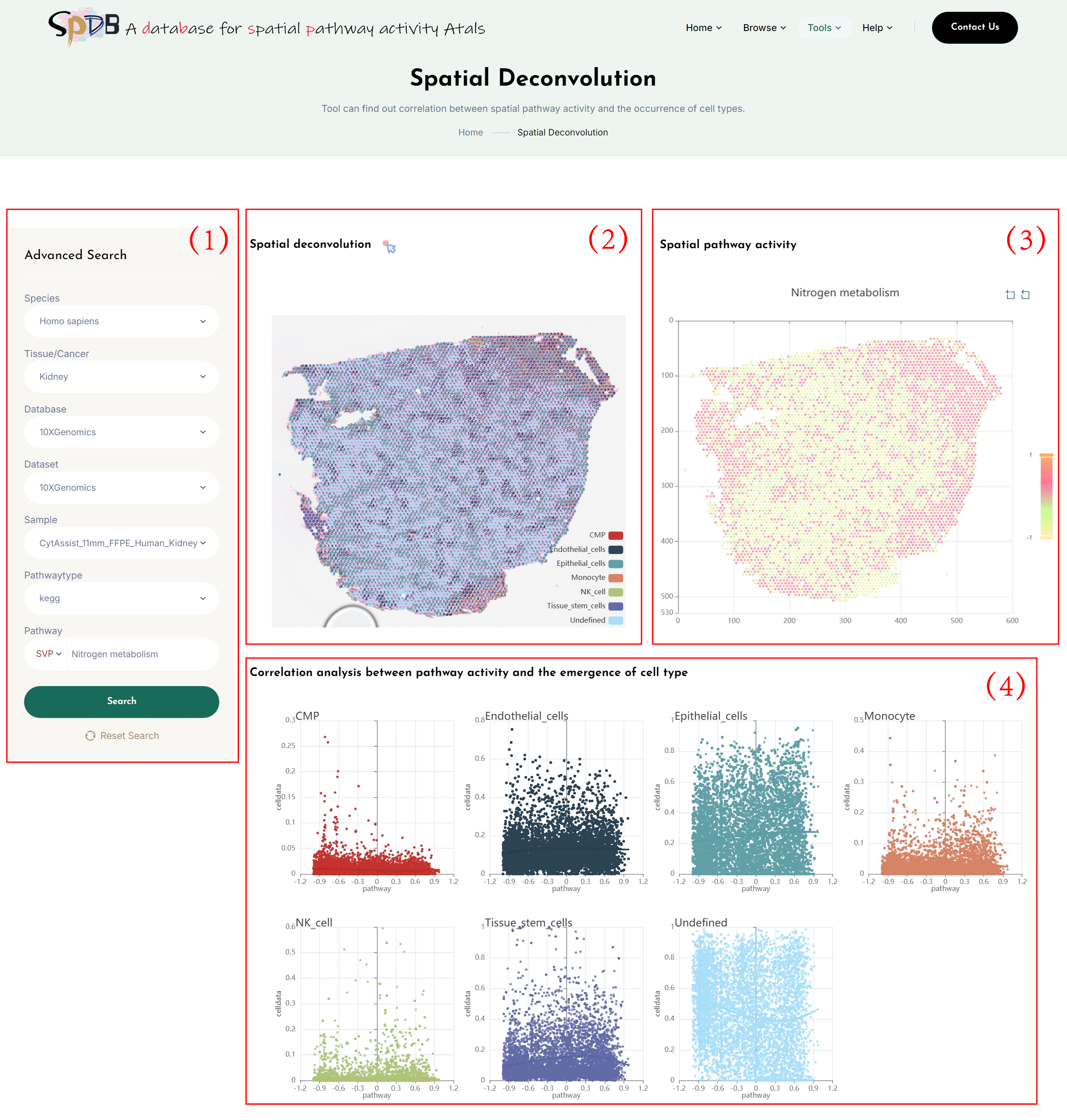
Spatial Deconvolution
(1)Click on the 7 dropdown menus to select the desired Species, Tissue/Cancer, Database, Dataset, Sample, pathwaytype and SVP.
Enter the name of the pathway of interest in the Pathway search box and click the “search” button to view the results.
(2)Using gene expression profiles and cell types combined with spatial location information, perform deconvolution analysis to obtain the proportion of different cell types in each spot. A pie chart is used to show the proportional distribution of cell types at spatial locations.
Additionally, if users are interested in one or more cell types, they can remove the spots for other cell types from the legend of the “Spatial Deconvolution,” leaving only the deconvolution results of the cell types they are interested in.
(3)Spatial transcriptomics clustering map colored by the spatial pathway activity of the selected pathway according to the spatial location of the section.
(4)Correlation scatter plot between pathway activity and the emergence of cell type.